Why Everything in the Economy Feels Connected


You check out at the grocery store and something feels off. You bought the same things you always buy — eggs, bread, chicken, a bag of coffee. But the total is $40 more than it was two years ago. You didn't upgrade your brands. You didn't add anything new. The cart looks identical.
Around the same time, a friend mentions her mortgage payment is $600 higher than her neighbor's, even though they bought identical homes on the same street — just two years apart. Another friend is nervous about his job. His company stopped backfilling open roles six months ago. Nobody got laid off, but something feels different.
These things feel unrelated. They're not. They're all symptoms of the same system, and understanding how that system works is one of the most useful things you can do for your financial life.
The single most important idea here: the economy is not a collection of separate things happening at the same time. It is one interconnected system, and a change in any part of it ripples through everything else.
Once you see the connections, the financial news stops feeling like random noise and starts feeling like a story you can follow.
The System Starts With Prices
Everything begins with inflation — specifically, with the Consumer Price Index, or CPI.
CPI measures how much everyday goods and services cost compared to a year ago. Think groceries, gas, rent, utilities, and clothing. When that number rises, your dollar buys less than it used to. That is inflation. When it falls — or rises too slowly — that is deflation, which sounds good but is actually dangerous for a different set of reasons.
The Federal Reserve targets roughly 2% annual inflation as the healthy zone. Below that, the economy risks a downward spiral where people delay spending because they expect prices to keep falling. Above that for too long, the purchasing power of everyone's savings and wages quietly erodes.
When CPI runs too hot, one institution has the job of responding: the Federal Reserve. And it has essentially one main tool.
But Before CPI Moves, PPI Usually Does
There is a number most people have never heard of that often predicts where CPI is heading before consumers feel it: the Producer Price Index, or PPI.
While CPI measures what you pay at the cash register, PPI measures what businesses pay to produce the things you buy. It tracks the prices of raw materials, wholesale goods, and services at the point of production — before they ever reach a store shelf.
Think of it this way. A food manufacturer buys wheat, packaging, and fuel. If the price of all three rises sharply, the manufacturer has a choice: absorb the higher costs and shrink their profit margin, or pass them along by raising prices. Most businesses, over time, do the latter.
That is why PPI is a leading indicator for CPI. When producer prices rise today, consumer prices tend to follow in the weeks and months ahead. The price increase travels through the supply chain — from factory to distributor to retailer to you.
Real-world analogy: Think of PPI as the temperature of the water in a pipe before it reaches the tap. If the water entering the pipe is getting hotter, what comes out of your faucet will soon be hotter too. CPI is what you feel at the tap. PPI is what is happening upstream.
This is why economists and investors watch PPI closely — not because it directly affects your wallet today, but because it tells you what is likely coming. A sustained rise in PPI is one of the earliest warning signals that inflation is building pressure in the system before it appears in the headline CPI number.
On the Sora Finance dashboard, PPI is tracked monthly using the Bureau of Labor Statistics' Final Demand index. When you see PPI trending up persistently, the implication is clear: CPI is likely to follow, and the Fed is watching the same data.
The Fed's One Big Lever
The Federal Reserve sets the Federal Funds Rate — the interest rate banks charge each other to borrow money overnight. This sounds technical, but the effect is immediate and far-reaching: when this rate goes up, the cost of borrowing money rises across the entire economy.
Think of the Fed Rate as a thermostat for economic activity. When inflation heats up, the Fed turns the thermostat up — making borrowing more expensive — to cool things down. When the economy cools too much, the Fed turns it back down to encourage spending and growth again.
Real-world analogy: Imagine a town with one water pump that supplies the whole area. When too much water is flowing and flooding fields, the town manager tightens the valve. Less water flows everywhere downstream — to farms, to homes, to businesses. The Fed Rate is that valve. Tighten it, and less money flows through the whole economy.
This is why when you hear "the Fed raised rates," you should not think of it as an abstract Wall Street event. It is a direct change in the cost of every car loan, credit card, business expansion, and home purchase in the country.
And critically — the Fed watches PPI as part of its inflation toolkit. A rising PPI, sustained over several months, increases the likelihood that the Fed will raise rates to get ahead of the consumer inflation it knows is coming.
The Diagram: How the Economic Indicators Connect
Before going deeper, here is a visual map of the full system. Every indicator on the Sora Finance dashboard plays a role, and they all connect.
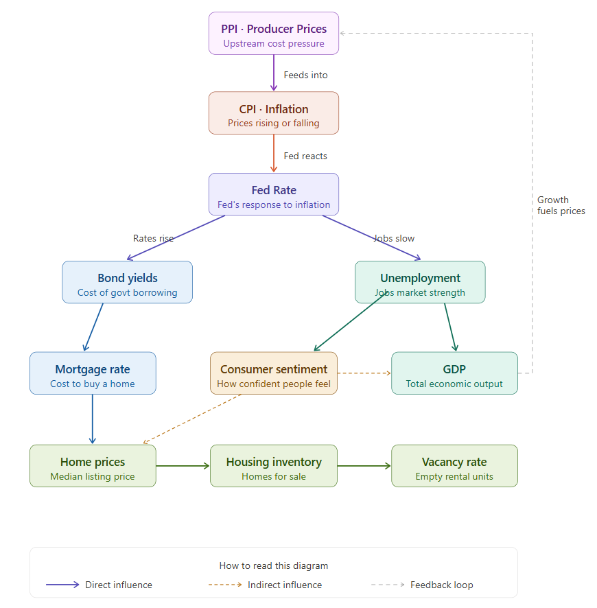
Read it top to bottom. PPI feeds into CPI as an early warning signal. CPI triggers the Fed. The Fed ripples into Bond Yields and Unemployment. Those ripple into Mortgage Rates, Consumer Sentiment, and GDP. And those ultimately shape the housing market indicators at the bottom. The dashed line on the right shows the feedback loop that closes the circle.
Now let's walk through each connection.
From the Fed to Bond Yields: The Benchmark That Moves Everything
When the Fed raises its overnight rate, investors who hold government bonds immediately face a question: why lock money up for 10 years at the old yield when short-term accounts now pay more? The answer is they would not. So they sell bonds. Bond prices fall, and yields rise to attract buyers back.
The 10-Year Treasury Yield — the interest rate the government pays to borrow for a decade — is the benchmark that everything else in the economy gets priced against. Mortgage lenders look at it. Corporate bond issuers look at it. Student loan rates are set based on it.
Mortgage Rate = 10-Year Treasury Yield + Risk Premium
When the 10-year yield is at 4%, mortgage rates typically run between 5.5% and 6.5%. When it jumps to 5%, mortgage rates follow to roughly 6.5% to 7.5%. The spread is not perfectly fixed, but the relationship is tight enough that watching bond yields gives you a reliable preview of where mortgage rates are heading — sometimes weeks before the change shows up in a rate quote.
From the Fed to Unemployment: The Slowest Domino
Here is the connection most people underestimate — not because it is subtle, but because it is slow.
When the Fed raises rates, businesses pay more to borrow money for expansion, equipment, new locations, and inventory. Projects that made sense at 4% interest no longer make sense at 7%. So companies slow down. They stop hiring. Eventually, some start cutting.
The critical thing to understand: this process takes 12 to 18 months to fully show up in the data. The Fed raises rates today. Unemployment rises a year and a half from now. That lag is where policy mistakes happen — the Fed sometimes overtightens because the pain has not arrived yet, then the pain arrives after they have already started cutting again.
Real-world analogy: It is like turning off the heat in a large building. The thermostat drops immediately, but the rooms stay warm for hours. By the time the building feels cold, the furnace has been off for a long time. The Fed is the thermostat. Unemployment is the room temperature.
When you see unemployment rising on the dashboard, the Fed Rate decision that caused it was made over a year ago.
From Bond Yields to Mortgage Rates: The Connection to Your Home
Bond yields do not stay on Wall Street. They follow you home — literally.
Mortgage lenders price their loans against the 10-Year Treasury yield because most mortgages, even though they are 30-year loans, get paid off or refinanced in roughly 7 to 10 years. The 10-year yield represents what a "safe" investment of similar duration should earn. Everything on top of that is the premium lenders charge for the extra risk of lending to an individual who might default.
The practical impact is direct and significant. On a $400,000 loan:
- At 5% interest, your monthly payment is roughly $2,150
- At 6% interest, your monthly payment is roughly $2,400
- At 7% interest, your monthly payment is roughly $2,660
- At 8% interest, your monthly payment is roughly $2,935
A single percentage point rise in mortgage rates — driven by bond yields moving — adds $250 to $300 to your monthly payment. Over 30 years, that is $90,000 to $108,000 in additional interest. The bond market, which most people assume only matters to pension funds, is directly determining how much house you can afford.
From Unemployment to Consumer Sentiment: The Psychology of the Economy
Unemployment affects sentiment in two waves, and the second one is bigger than the first.
The first wave is obvious — people who lose jobs immediately cut spending, delay purchases, and focus on surviving until the next paycheck.
The second wave hits everyone else. When layoffs make the news, people who still have jobs start behaving differently. They build up savings. They put off buying a car. They skip the vacation. They hesitate to ask for a raise. The fear of unemployment spreads economic caution far beyond the people who are actually unemployed.
This is why the Consumer Sentiment Index — which measures how confident everyday Americans feel about their finances and the economy — can fall sharply even when the unemployment rate is still relatively low. The number on the dashboard reflects who has lost a job. Sentiment reflects how everyone feels about whether they might be next.
Real-world analogy: Imagine a neighborhood where one house has a visible water leak. The homeowner with the leak is clearly affected. But every neighbor starts checking their own pipes. Spending on home repairs goes up across the street — not because everyone is leaking, but because the fear of leaking has spread. Unemployment is the visible leak. Consumer sentiment measures how many neighbors are checking their pipes.
Consumer sentiment is also a leading indicator — it often moves before the official economic data catches up. When sentiment falls sharply on your dashboard, spending is likely to slow down in the months ahead, which will eventually show up in GDP, then in corporate earnings, then in hiring decisions.
From Unemployment and Sentiment to GDP: The Scoreboard
GDP is the total of all economic activity in the United States — every purchase, every service, every unit of production. It is the broadest measure of economic health, and it is directly tied to unemployment and consumer sentiment through one simple mechanism: consumer spending drives roughly 70% of GDP.
When people are employed and confident, they spend. When they spend, businesses earn. When businesses earn, they hire and invest. When they hire, more people are employed and confident. The cycle reinforces itself upward.
When unemployment rises and confidence falls, every part of that cycle reverses simultaneously. Less spending, less revenue, less hiring, more caution — and GDP growth slows or turns negative.
Two consecutive quarters of negative GDP growth is the official definition of a recession. That is it. Not a stock market crash, not a bank failure — just two quarters of the economy producing less than it did the quarter before.
Watching unemployment and consumer sentiment together on your dashboard gives you the earliest signal of where GDP is heading — months before the official GDP number is published.
From Mortgage Rates to Home Prices: The Affordability Squeeze
Most people think about home prices in terms of the listing price. But what actually drives demand is the monthly payment — which is determined by the listing price and the interest rate together.
A buyer who can comfortably afford $2,000 per month qualifies for:
- Roughly $475,000 at a 3% mortgage rate
- Roughly $372,000 at a 5% mortgage rate
- Roughly $302,000 at a 7% mortgage rate
That is a $173,000 drop in purchasing power from a 4-point rise in rates, with zero change in income. When mortgage rates rise, the pool of qualified buyers for any given home shrinks significantly. With fewer buyers competing, sellers face pressure to reduce prices — or wait much longer to find a buyer.
But here is the counterintuitive part: prices do not always fall quickly even when rates are high. This is because of the "lock-in effect." Homeowners who bought when rates were low are sitting on mortgages at 3% or 4%. If they sell and buy their next home at 7%, they potentially double their monthly payment. So they stay put. When millions of homeowners make that same rational decision, inventory stays low — and low inventory acts as a floor under prices even when demand has dropped.
This is why a rising-rate housing market often feels frozen rather than crashing. Transaction volume collapses, but prices do not fall as sharply as the rate increase would suggest.
From Home Prices to Housing Inventory: Supply and Demand in Slow Motion
Housing inventory measures how many homes are actively for sale at any given moment. Its relationship with home prices is the most direct supply-and-demand dynamic in all of economics — just in slow motion.
Low inventory, high prices. High inventory, lower prices. But the relationship runs both ways: prices also affect inventory, because rising prices encourage sellers to list and developers to build, while falling prices keep hesitant sellers on the sidelines.
The lock-in effect shapes inventory most powerfully right now. When millions of homeowners have sub-4% mortgages and current rates are near 7%, the financial penalty for selling is enormous. Supply stays tight not because homes do not exist, but because owners have a powerful financial reason not to sell.
Inventory is actually the leading indicator of the two. It tends to move before prices do — sellers change their behavior before prices fully reflect the new market conditions. When inventory starts rising while prices are still high, that is often the earliest signal that prices are about to soften. When inventory starts falling while prices are still flat or low, a recovery is often building before it shows up in the price data.
From Housing Inventory to Vacancy Rate: The Rental Market Signal
The Rental Vacancy Rate measures the percentage of rental units sitting empty across the country. It is published quarterly by the U.S. Census Bureau, and it connects to housing inventory through one straightforward dynamic: when buying becomes unaffordable, renting becomes the alternative.
When mortgage rates rise and home prices stay high, people who might have bought instead rent. Demand for rentals increases. Landlords have pricing power. Rents rise. The vacancy rate falls.
When home prices soften and buying becomes more accessible again, some renters become buyers. Rental demand drops. Vacancy rates rise. Landlords compete for tenants. Rents stabilize or fall.
This is why the vacancy rate is the economy's signal for the rental market specifically — it tells you where the balance of power sits between renters and landlords, and it moves with the same forces that drive everything else in the system.
The Feedback Loop That Closes the Circle
Here is the part that makes this a system rather than a one-way chain.
When the economy grows strongly — GDP rising, unemployment low, consumers spending confidently — two things happen that eventually bring inflation back. Workers gain bargaining power and wages rise. Businesses facing strong demand raise prices to protect their margins. Both dynamics push CPI higher.
And before CPI fully registers that pressure, PPI often rises first — signaling that the cost increases are already moving through the supply chain toward consumers.
When CPI rises above 2% consistently, the Fed raises rates again. And the whole chain restarts.
This is not a bug in the system. It is a feature — the economy's built-in self-correcting mechanism. Strong growth eventually generates inflation. Inflation triggers higher rates. Higher rates slow the economy. A slower economy brings inflation down. Lower inflation allows the Fed to cut rates. Lower rates stimulate growth. Growth eventually generates inflation again.
The cycle runs on roughly an 8 to 12 year timeline, though the length varies. And every single indicator on your Sora Finance dashboard is measuring a different part of that cycle — at a different point in the chain, with different lags.
How to Read Your Dashboard as One Story
Now that you can see the connections, your Finance Dashboard stops being 11 separate numbers and becomes one continuous story.
PPI rising is the early warning. It tells you price pressure is building in the supply chain and consumer inflation is likely coming.
CPI rising is the opening line. It tells you the economy is running hot and the Fed is likely to respond.
Fed Rate rising is the response. It tells you borrowing is getting more expensive and the chain reaction has begun.
Bond Yields rising is the first ripple. It tells you the benchmark for all other borrowing has moved.
Mortgage Rates rising is the housing chapter. It tells you home affordability is shrinking and the housing market is about to slow.
Unemployment rising is the labor chapter — delayed, but coming. It tells you the rate hikes are starting to bite into the real economy.
Consumer Sentiment falling is the psychology chapter. It tells you people feel the slowdown before the official data confirms it.
GDP slowing is the scoreboard chapter. It tells you the cumulative effect of everything above is showing up in total economic output.
Home Prices softening is the housing market adjusting. It tells you the affordability squeeze is starting to move prices.
Housing Inventory rising is the leading signal for what comes next in housing. It tells you sellers are finally moving, and prices have room to fall further.
Vacancy Rate rising is the rental market chapter. It tells you renters are gaining leverage as the ownership market cools.
And then — eventually — lower rates, recovering confidence, rising GDP, and PPI starting to tick back up before CPI follows. The story restarts.
What to Watch For
You do not need to predict the future to use this framework. You just need to notice where the chain currently stands.
Look at PPI first — it is the earliest signal in the chain. A sustained rise in PPI tells you consumer inflation is building before CPI confirms it.
Look at CPI and Fed Rate next — they tell you what phase of the cycle the economy is in and how the Fed is responding.
Look at Bond Yields and Mortgage Rates — they tell you what is happening to borrowing costs right now.
Look at Unemployment and Consumer Sentiment together — they tell you how the real economy and real people are responding.
Look at GDP — it confirms whether those responses are showing up in total output.
Look at the housing indicators last — they tell you the long-delayed final chapter of whatever the Fed did 12 to 24 months ago.
No single number tells the whole story. But all eleven together — tracked over time, understood as a connected system — give you something genuinely rare: a clear picture of where the economy is, where it has been, and where it is most likely heading next.
Check the live data behind every indicator in this post on the Sora Finance Dashboard. All eleven indicators, updated daily, explained in plain English.
All content on Sora Finance is for educational purposes only and does not constitute financial advice. Please consult a qualified financial professional before making investment decisions.